
5 Things I look for before a website makes it into my inspiration directory

I keep a running bookmark list of websites I love, the ones I pull up when I'm starting a new project, need a splash of inspiration, or just want to remind myself what "good" actually looks like. Some of these went straight into the Shopify website directory. Some of them haven’t.
As I build out the initial stages, I’m consciously choosing sites that I think do more to stand out. More color. More unique sections. Something much more than a template.
The bar is high, so while I’m being choosy, here’s the criteria of a website that makes it in.
1. Standout design
There's a difference between a website that looks nice and a website that stops the scroll. One does its job, and one make you want to be a part of it. The website takes brand-building to another level on-page.
The sites I add usually do something I haven't seen a hundred times before. Maybe they feature an unexpected layout choice, a color palette that commits, a scroll interaction that feels meaningful instead of just showing off.
"Clean and modern" is the floor, not the ceiling. I'm looking for the sites that decided to have a point of view about how they look, not just a template that conforms.
2. Conversion logic that makes sense
Design that doesn't lead anywhere is just decoration. The sites that earn a spot in the gallery make the path from "I'm browsing" to "I'm buying" feel obvious. It’s not that they’re dumbed down or too clinical. Instead, you feel that every step was clearly designed on purpose.
What do I mean? The classic progressive path could look like Homepage > Collection > Product Page > Cart. But every ecommerce seller knows there are a things like the copywriting, images you use and where you place them, trust signals, and a dozen tiny points of friction that could get in the way between the shopper and the sale.
For a site that gets this right, the CTAs show up where you'd actually want them. The next step is never a mystery. Nothing about the buying experience feels like it was bolted on after the design was already finished. Big brands have the budget to test these things. That’s why you’ll see their websites always change.
If you visit a site and it looks different today than when it was first posted, just know it’s because the brand is trying something new. Or, it’s because they’ve been testing and found a better conversion pattern than before.
Keep in mind, what works for their audience might not be what works for yours. but it could be worth a try.
3. Strong branding
This is the one I'm most picky about. A website can have gorgeous individual pages and still feel like five different brands stitched together. Branding doesn’t just mean the visual branding, though that is extremely important. It also means the voice, the page copy, the product descriptions (often a lacklustre spot), and the imagery.
For example, take a look at Hello Updo’s product photos. Studio Plush designed custom image overlays to callout features and benefits — something you often see on Amazon sites, but which feels totally at home here.
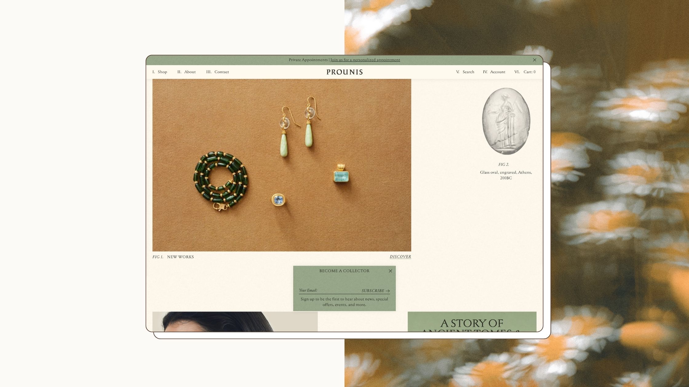
Or, see Prounis Jewelry’s broken grid editorial layout. Each detail feels considered, and even though you don’t see standard conversion features like many other high-end brands push.
Many brands get the colors right, and but that’s just the floor. Strong branding means your visitors can tell it’s you
4. A distinct point of view
If you swapped the logo, could this be any other brand in the category? For a lot of sites, the honest answer is yes — and that's exactly why they don't make the list. The ones I save have a value, a stance, or a way of talking about themselves that couldn't just be copy-pasted onto a competitor's site. That's harder to pull off than good design alone, because it means the brand actually knows what makes it different and isn't afraid to lead with it.
Is sustainability important to the brand and their audience? If so, I want to see it, and not just in a few icons. What does sustainability mean to you? Are you certified B Corp? Don’t hide this part of your story, spell it out.
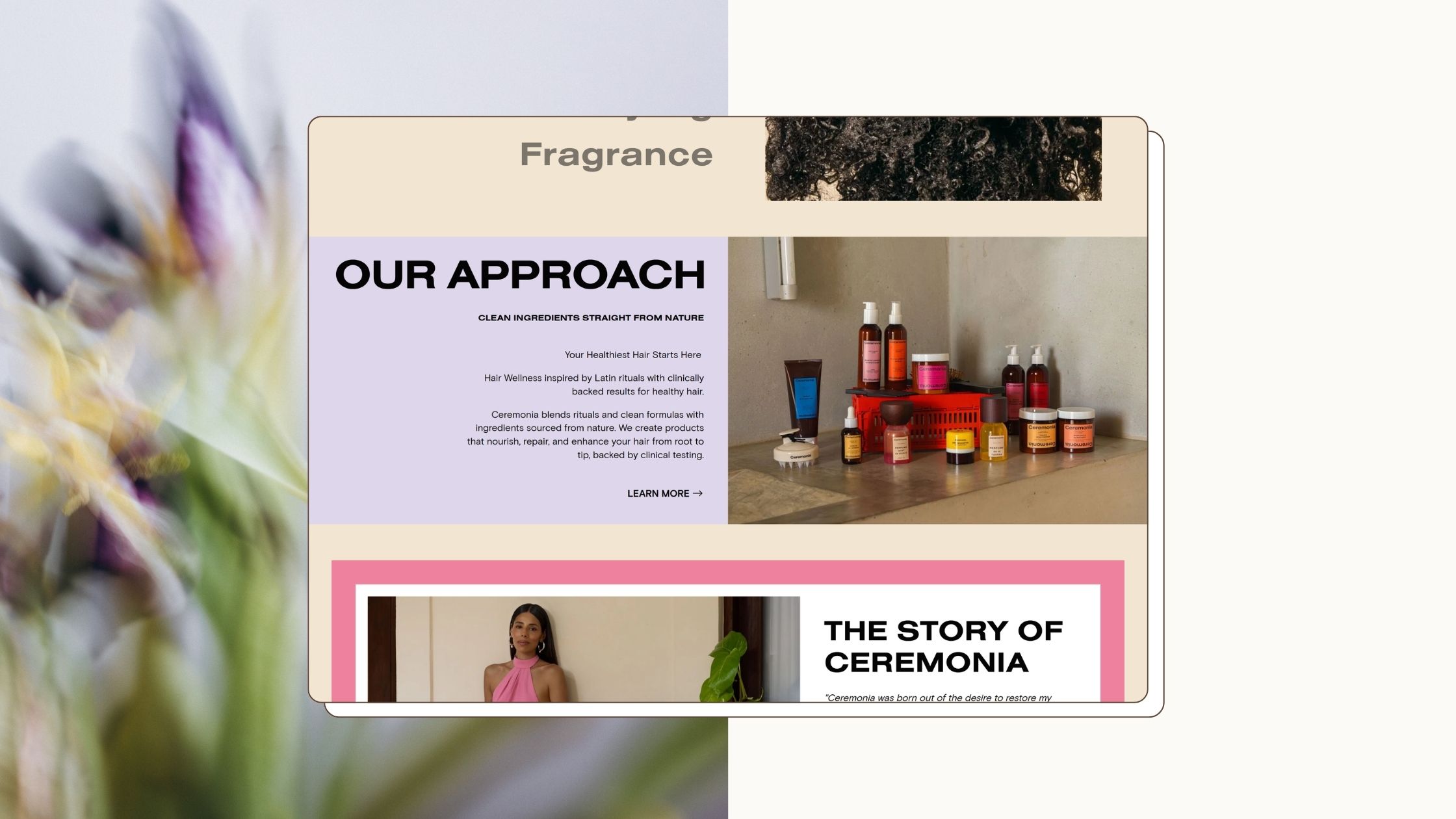
Ceremonia does a great job of this in its About page values slides. Other brands, like Eadem, build their difference into every product page.
Are you the cleanest or most natural in your field? What makes you special? Don’t bury your differences.
5. Mobile that feels intentional
Most sites are technically responsive at this point, so that's not the bar anymore either. What I'm looking for is a mobile experience that was clearly designed, not just resized. Type that's sized to actually read on a phone. Layouts that were rethought for a smaller screen instead of squished into one. Interactions that feel native to touch instead of a shrunken version of a desktop hover state.
When a brand gets this right, it's usually a sign the whole team was paying attention to how people actually experience the site. Since almost 80% of some brands’ traffic comes from mobile instead of desktop, this is particularly important.
That’s why I’ve included the mobile version in the gallery, too. And as this grows, I’ll also be spotlighting the unique features that carry over. You can browse the current inspiration and measure your own site against these giants.
Where does your website sit?
And if you're looking at your own site and wondering how it stacks up on any of these points, that's usually where a good audit starts. Another pair of eyes that can give you solid feedback about the look and feel of your website, measured against experience and a detailed checklist I use on client sites.
I’m currently offering 3 free website audits. Want to get your site in order, so you know what to focus on next? Learn more and sign up for a free audit here.

Get New Inspo Weekly
Join our Substack for weekly design and marketing inspiration, and behind the scenes peeks.